Projector Settings for Best ResultsUpdated 6 months ago
There are challenges that come with trying to set up the perfect show and achieving the best results possible. We have taken a deep dive into how to maneuver specific settings within the projector to get optimal performance from your projector. Below you will see a breakdown of specific settings and what they do along with the impacts they can have on your projection.
Display Mode:
These options will make adjustments to optimize projections for the media type that is coming from the projector (will vary case by case depending on project). We surprisingly stay away from bright and presentation modes. It has a tendency to wash out colors in these modes due to the increases in whites to maximize overall brightness. If the show you’re projecting is full of deep color, bright/presentation mode will sometimes have an opposite effect and make the colors seem dull by adding more white to the projection in their attempt to make it "brighter".
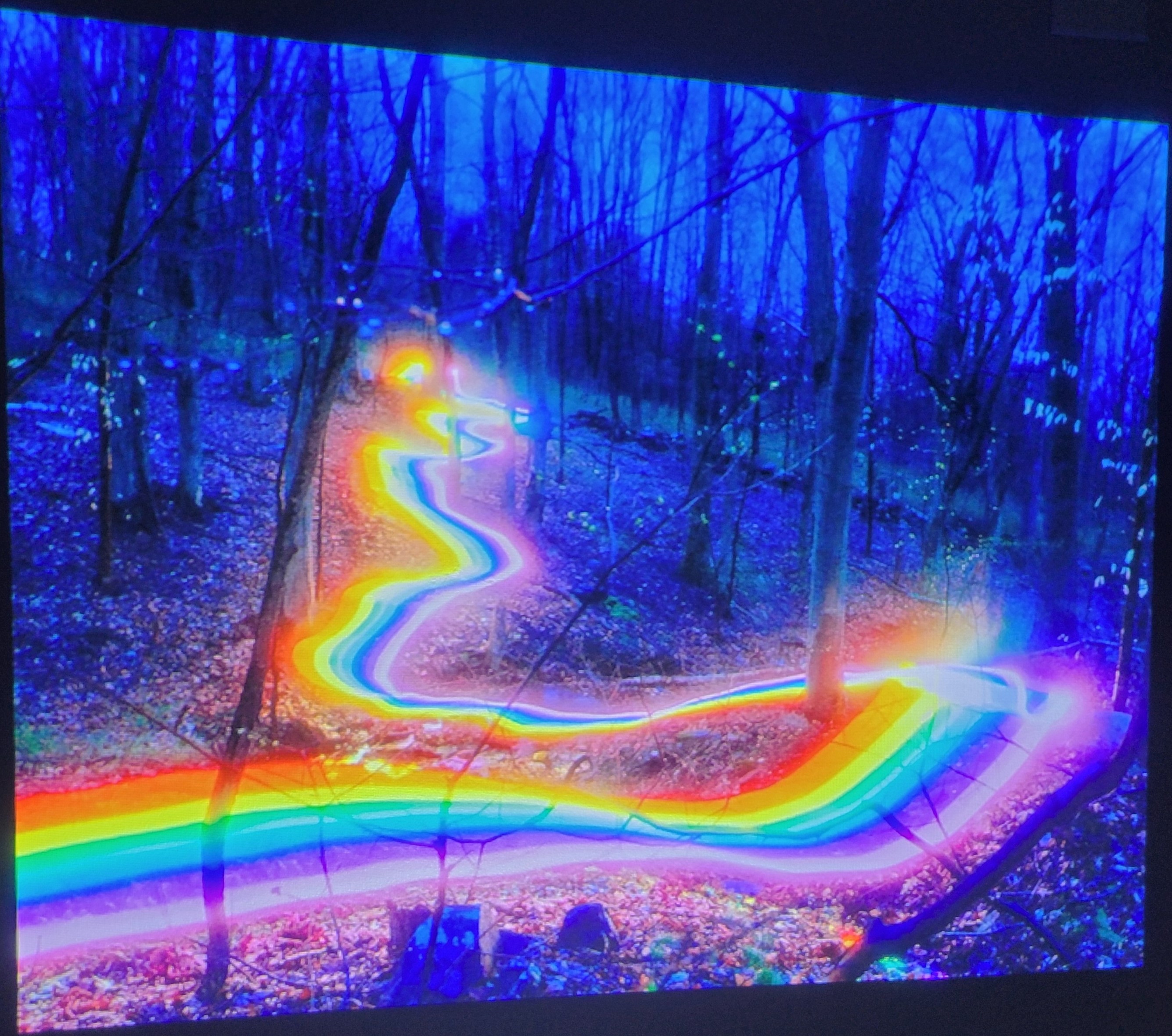
Bright Mode: We believe that this setting is at times a detriment to a quality projection show. When using bright, vibrant colors, bright mode can increase the exposure so much that the whites come through stronger than the colors, losing some of it's quality. Below is a picture of a rainbow projection displayed in bright mode.
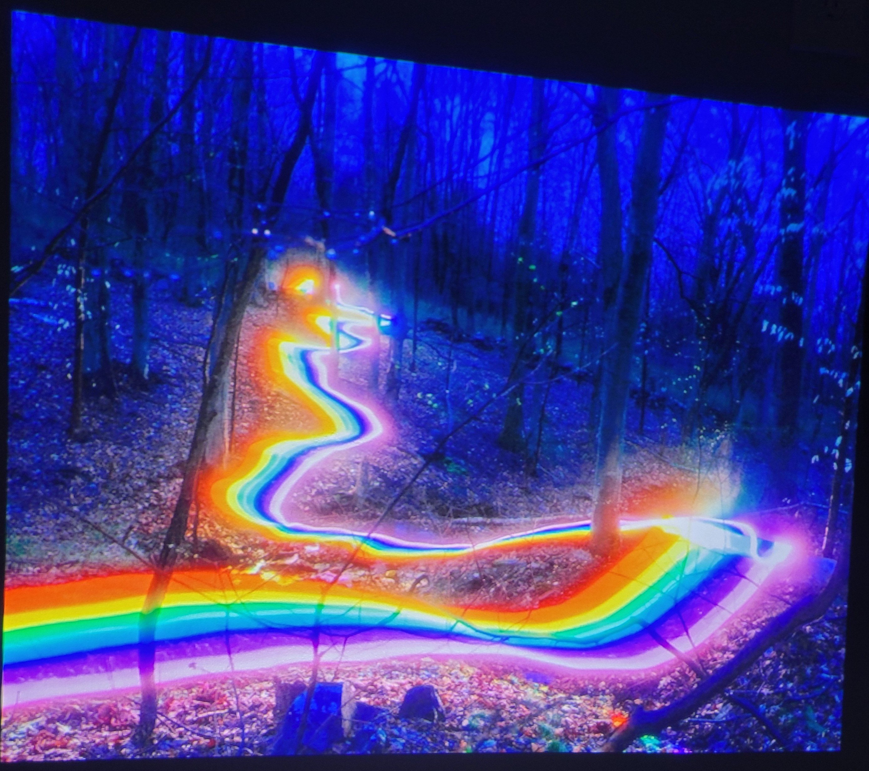
Cinema Mode: Get the truest, most vibrant colors if the media you’re projecting has a mixture of darker shadows or scales of gray/black that are needed to be seen in your show. Below you can see that the colors have more vibrance and depth when switched from bright mode to cinema mode.
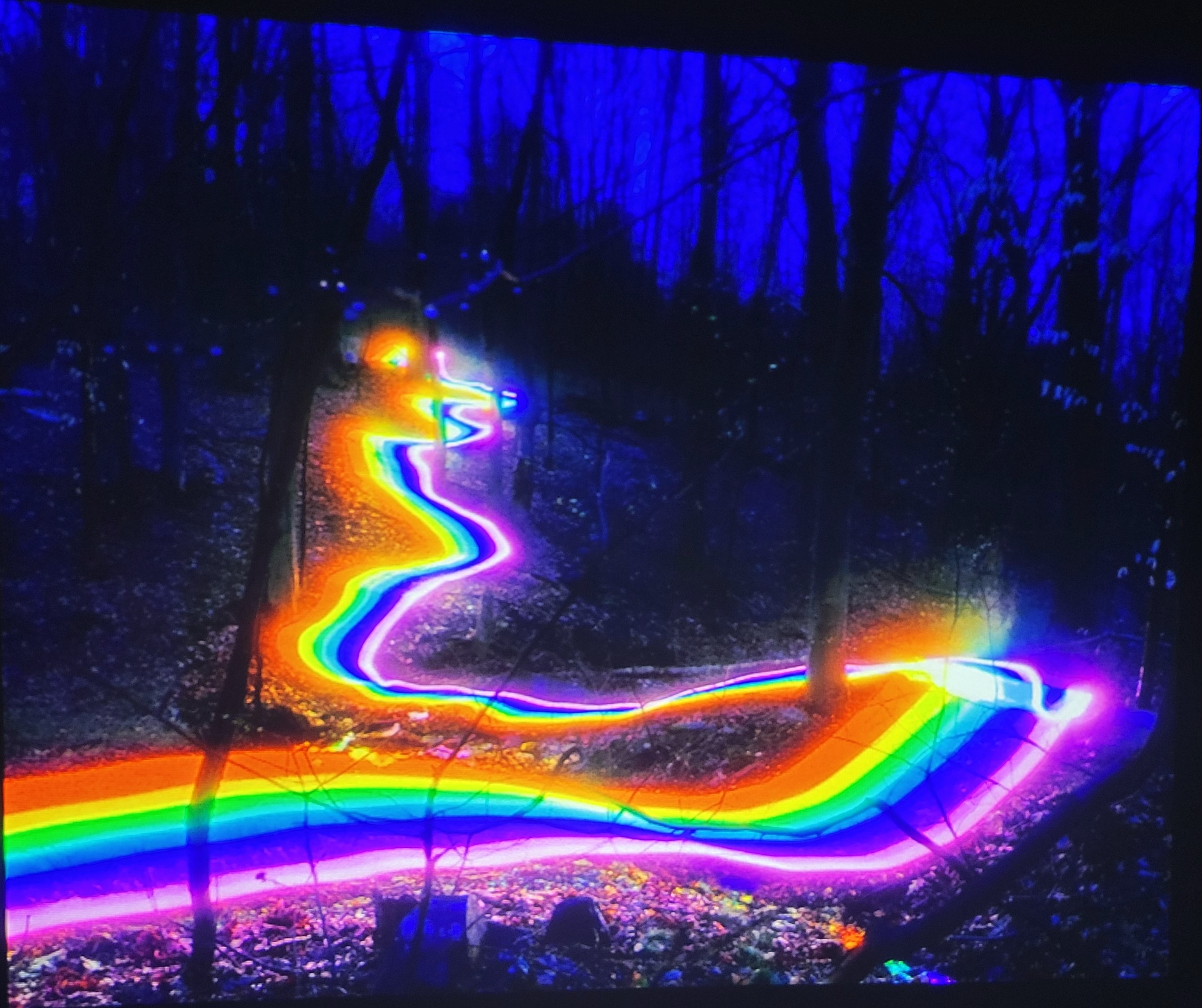
DICOM Sim Mode: Provides the highest color vibrance/brightness when the colors are bright and does not contain many necessary grays/blacks within the media. This display mode is our preferred setting for achieving great results with our projection shows.
Contrast:
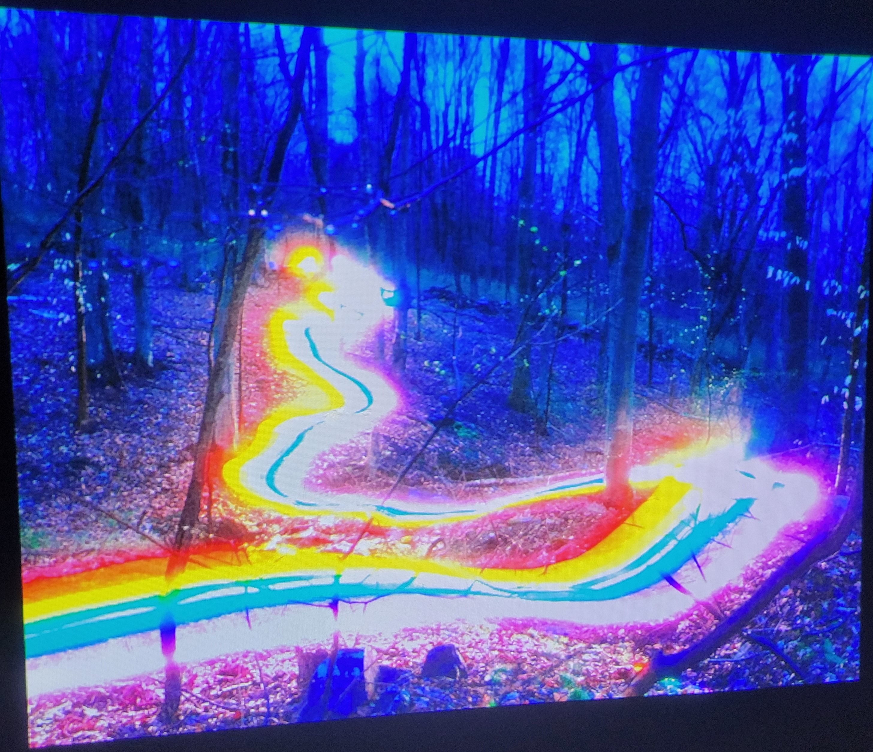
This setting will change the increase or decrease the amount of difference we can see from black to white. As you turn contrast down, everything gets darker and as you turn contrast up, the image gradually bleeds together and is overly white. This is a setting that we typically do not change. We will start to see some critical colors begin to bleed together if we increase contrast and decreasing contrast only makes the image darker. Below is the same image with high contrast.
Brilliant Color:
This setting is meant to increase the color gamut and brightness of colors without any loss of saturation or bleed. We have found that increasing this setting provides some great vibrance improvements on reds, blues, and greens specifically. This setting made a visible difference in person, but did not capture well when taking a photo.
RGB Gain/Bias:
This is a great setting to change when projecting onto a non-white surface. The gain portions of this setting are meant to increase the saturation of each color specifically within the media (red, green, and blue). This can be helpful when there is a specific portion of a project that is not showing up as expected. Adding a gain of that specific color can help brighten it even further and make it ‘pop’ more. The bias on the other hand adds that increase in specific color to the entirety of the projection, not just the specific color like the gain portion. This is especially helpful if being used on a red brick house where gains to green and blue will provide better color accuracy. If your house is blue, it may be beneficial to add green and red to balance back to accurate colors.
We hope that this article is helpful to improve and maximize the quality of projections for all equipment. There are still many factors that can affect the overall quality. Sometimes choosing a specific area of the house can make a drastic difference (moving the projector closer to the house will increase brightness/clarity). Something else that is very helpful for projection quality is using our spotlight tool before calibrating and get as much of the desired projection surface as physically possible within that area. Any light projected in that spot light that is not being included in your show is essentially being wasted. Another point to make with light being wasted is color. You want as much color as possible to add brightness to a show. Any black or dark colors in a projection show is essentially wasted light as well since dark media does not allow for any vibrance (imagine a flashlight that only shined black light). This is shown above by comparing the brightness of the rainbow to the trees.